First Go
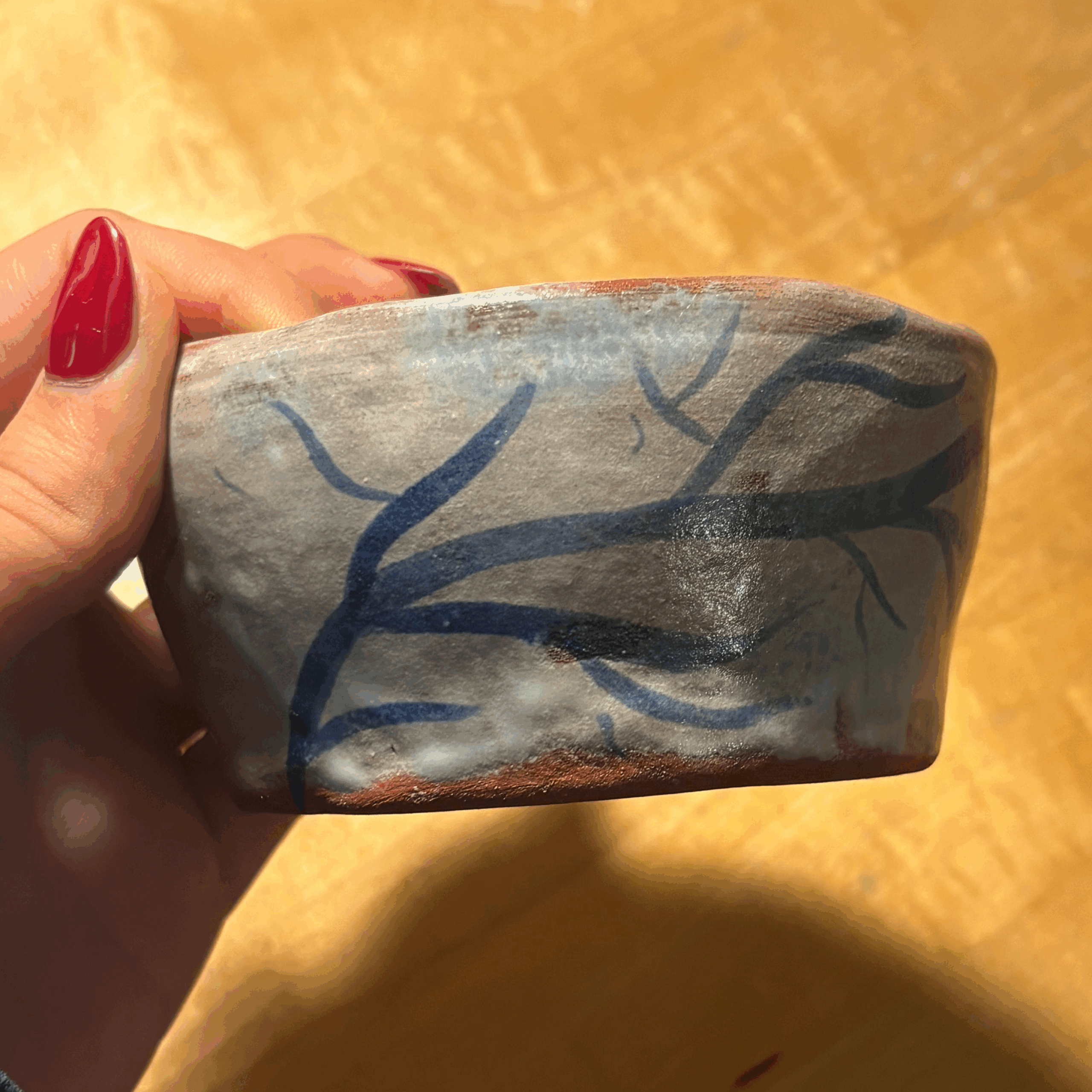
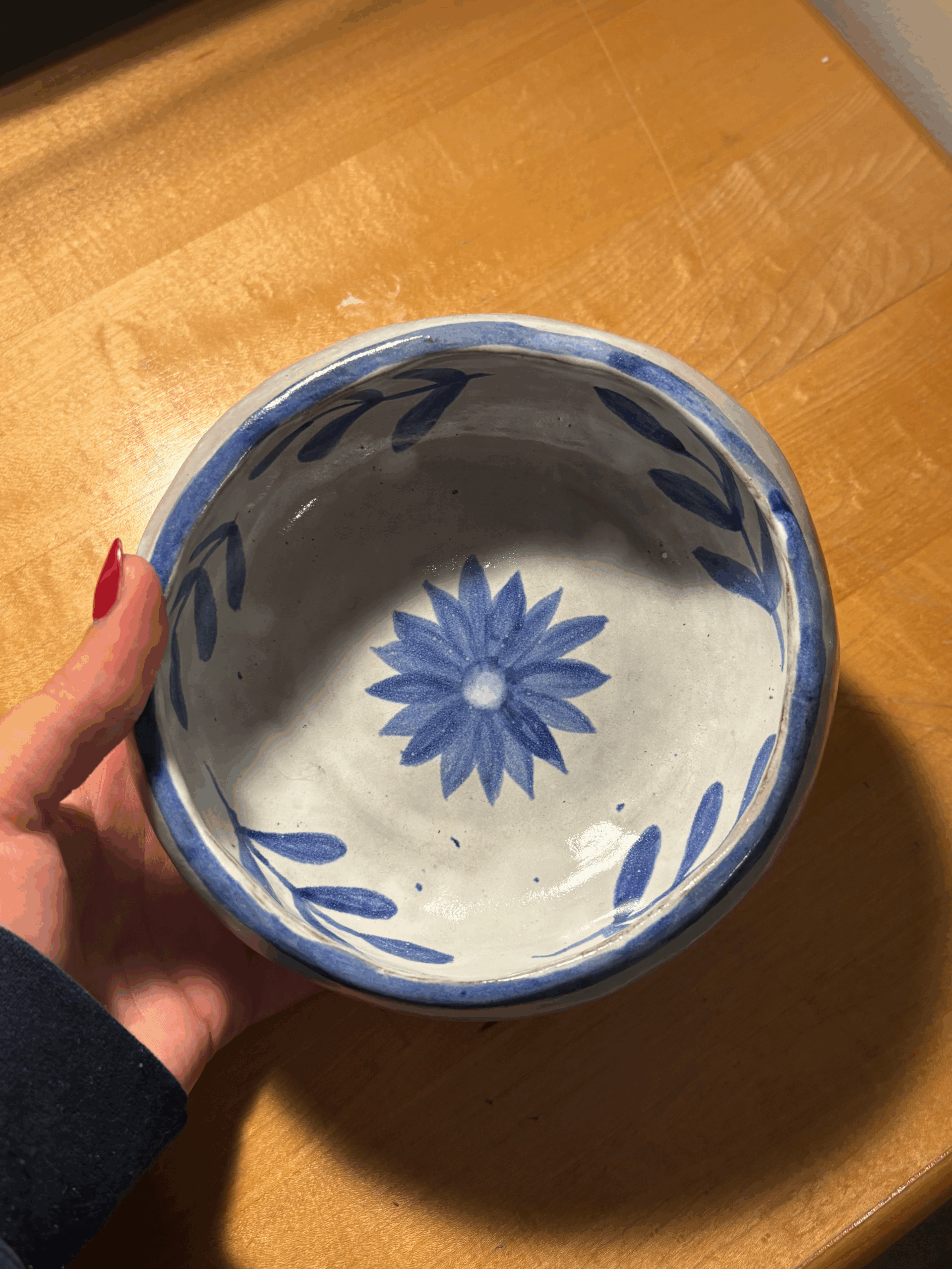
I chose to stick with the same color and theme palette as my first round of cups, keeping the set visually connected. I made two sizes: one smaller and one larger. The larger bowl has a rounded, almost oval shape that gives it a softer, more organic feel, while the smaller cup has straighter walls that rise cleanly upward for a more classic form. Together, they show two different ways of expressing the same palette and style.
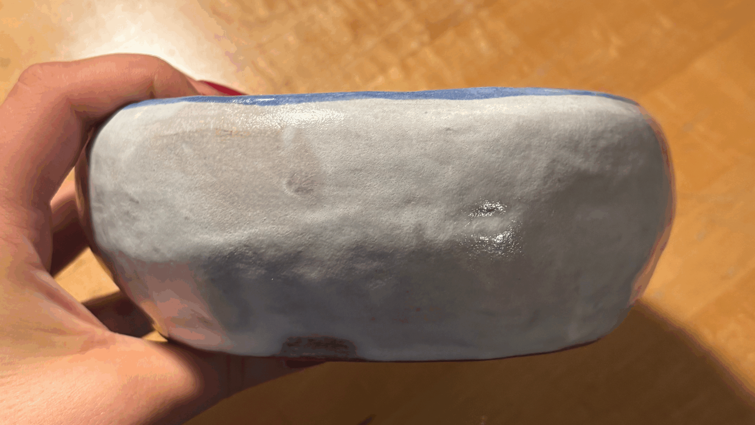
My first bowl — the larger one — ended up on the heavier side. It’s definitely bottom-heavy and has a few uneven, lumpy areas along the rim. The glaze fired lighter than I originally hoped for, but the small painted details came through exactly the way I envisioned. Even with its imperfections, it carries the character and texture of a piece that taught me something in the making.
The smaller bowl is also slightly bottom-heavy, and once again, the glaze came out somewhat patchy and thin. I experimented with a few different ways of painting the designs, but I’ll be real — I got frustrated and ended up going a bit all over the place because I just wanted to finish it. Even so, I still like how it turned out. It carries a kind of raw, unfinished energy that reflects where I was in the process, and there’s something authentic in that.