Plate 1
I chose to use the same flower pattern and blue accents again to keep the design consistent with the rest of the set. Maintaining those elements helps the pieces feel connected, almost like they’re speaking the same visual language. Even though each form has its own personality, the repeated motifs tie everything together and create a cohesive collection.
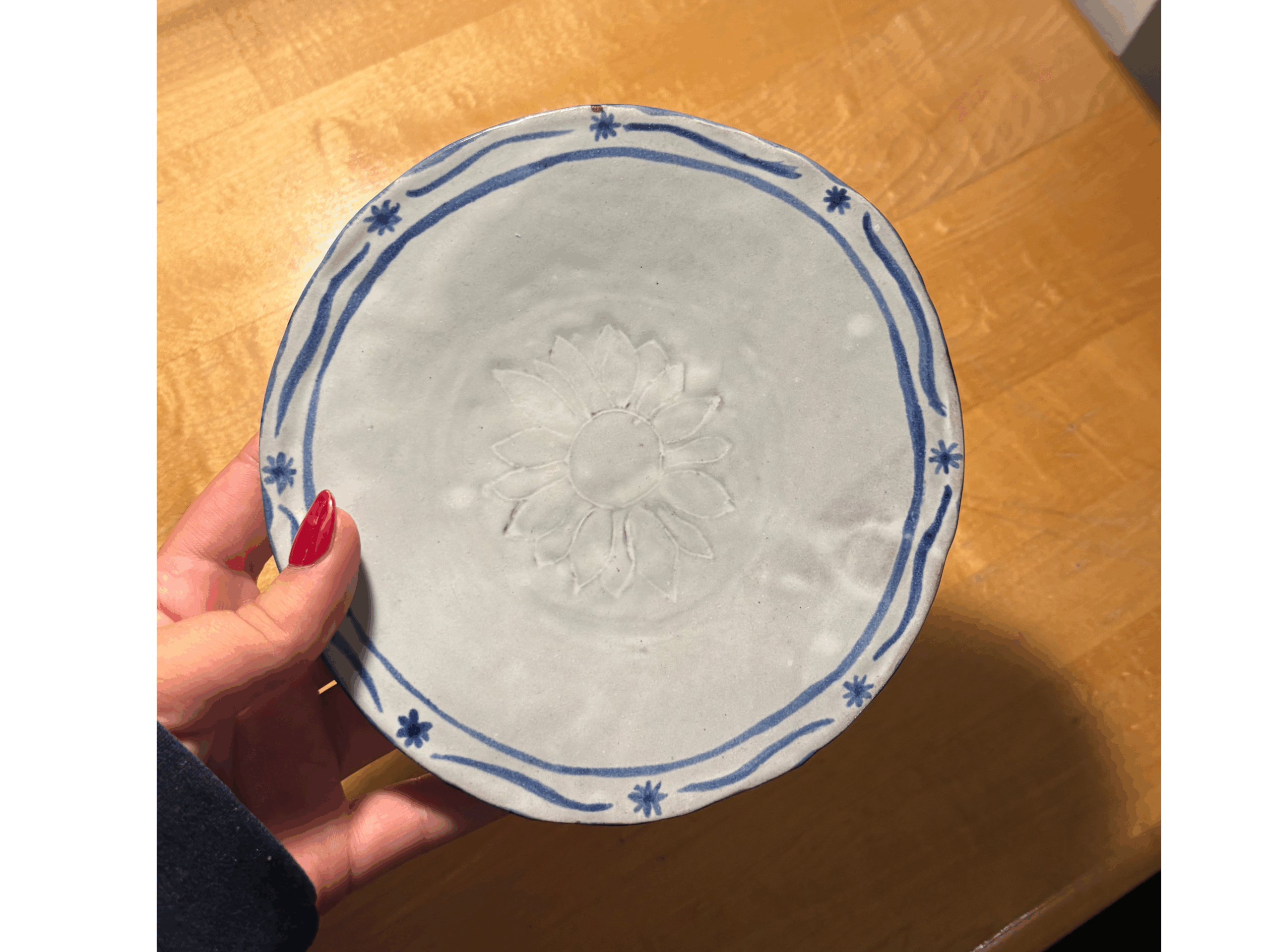
I also attempted a press plate with a small flower pattern on my first try, but the circular slabs I used was much thicker than planned and dried out faster than expected. When I pressed the design into the clay, it didn’t hold the pattern as cleanly or deeply as I wanted. After glazing it in white, the details filled in and became very subtle and spotty, almost disappearing into the surface. It was a learning moment, though — one that helped guide how I approached the later pieces.
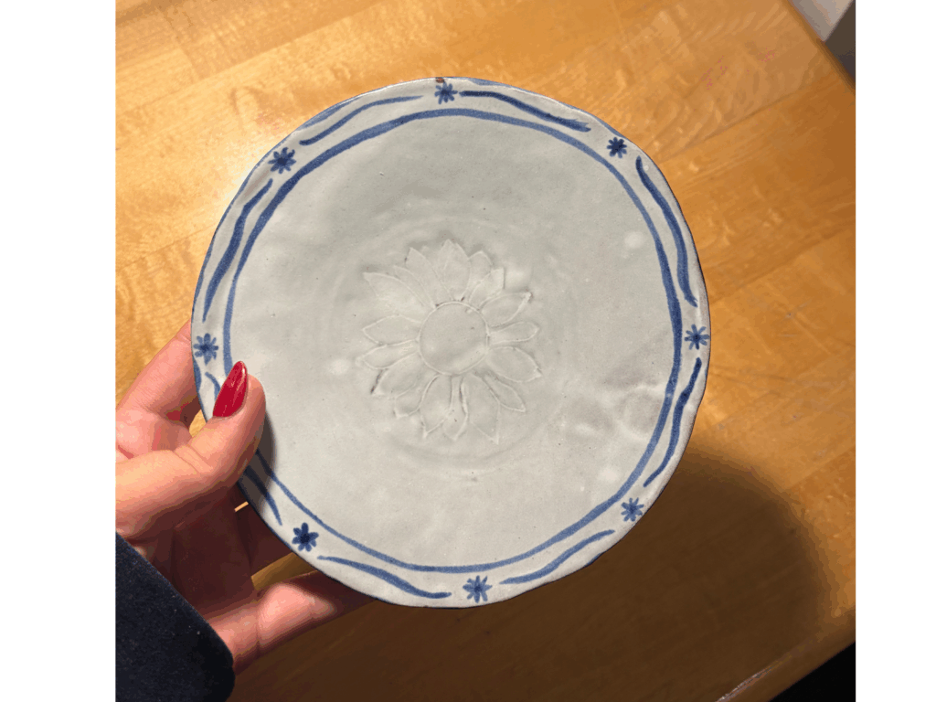
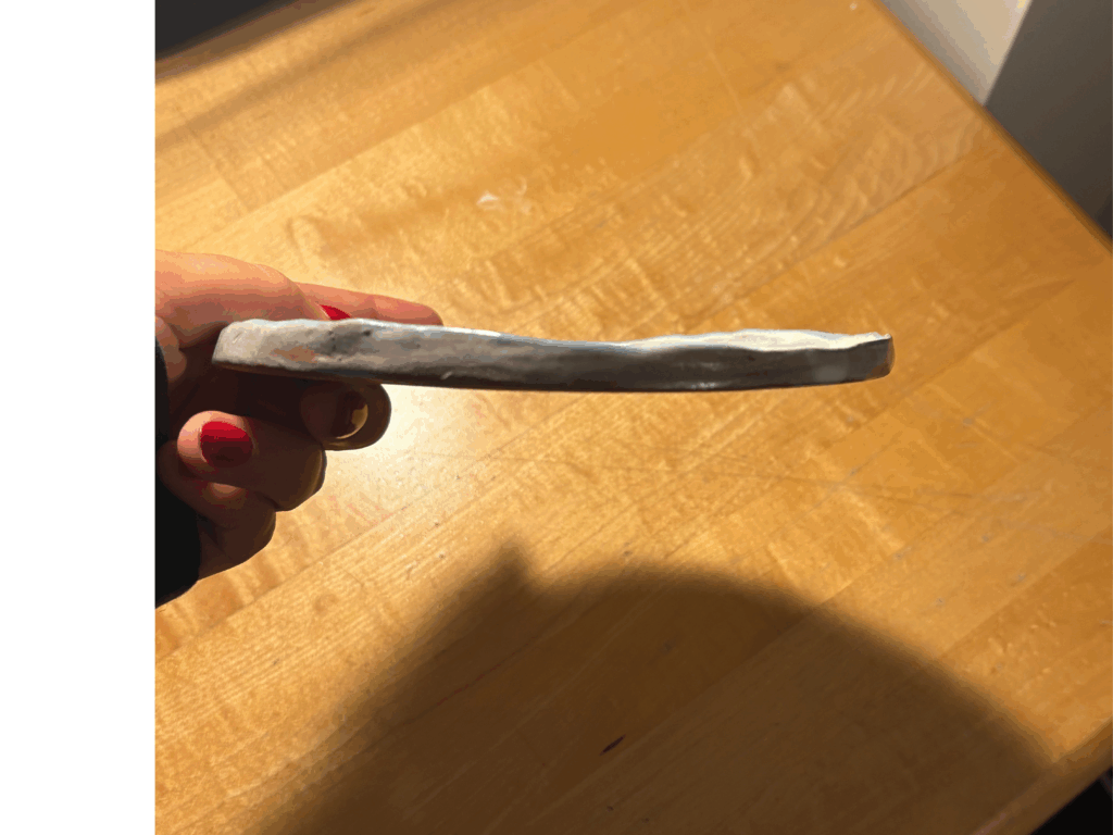
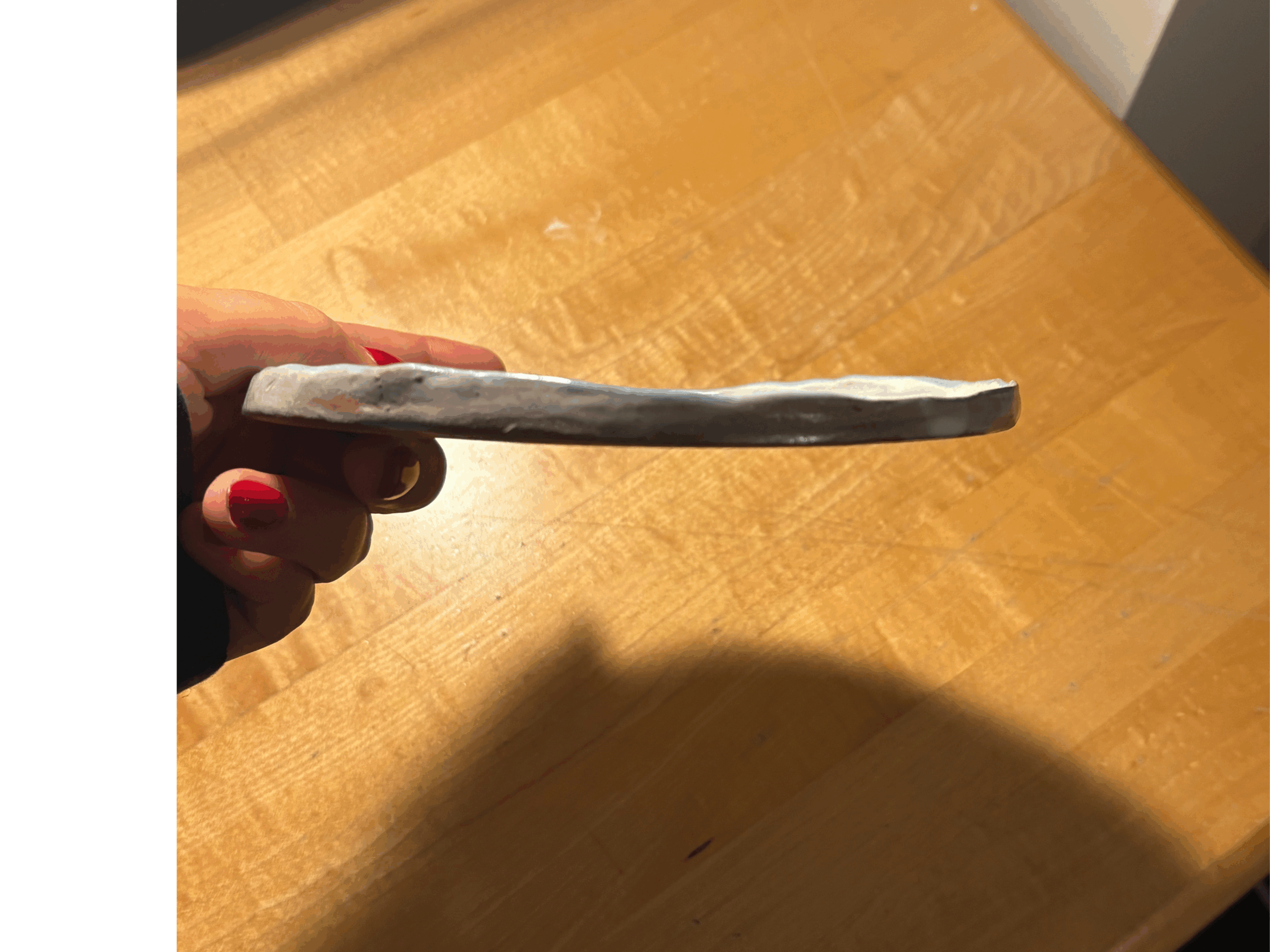
For my second attempts, I felt the pieces were drying too quickly again, so I carved them down to a thinner shape with a taller, more refined edge. I stayed committed to the white-and-blue flower theme, keeping the design in conversation with the rest of the set while giving this round a lighter, more delicate feel. it was on the thinner side for sure and warped in some places but i liked the end result a bit more then the first
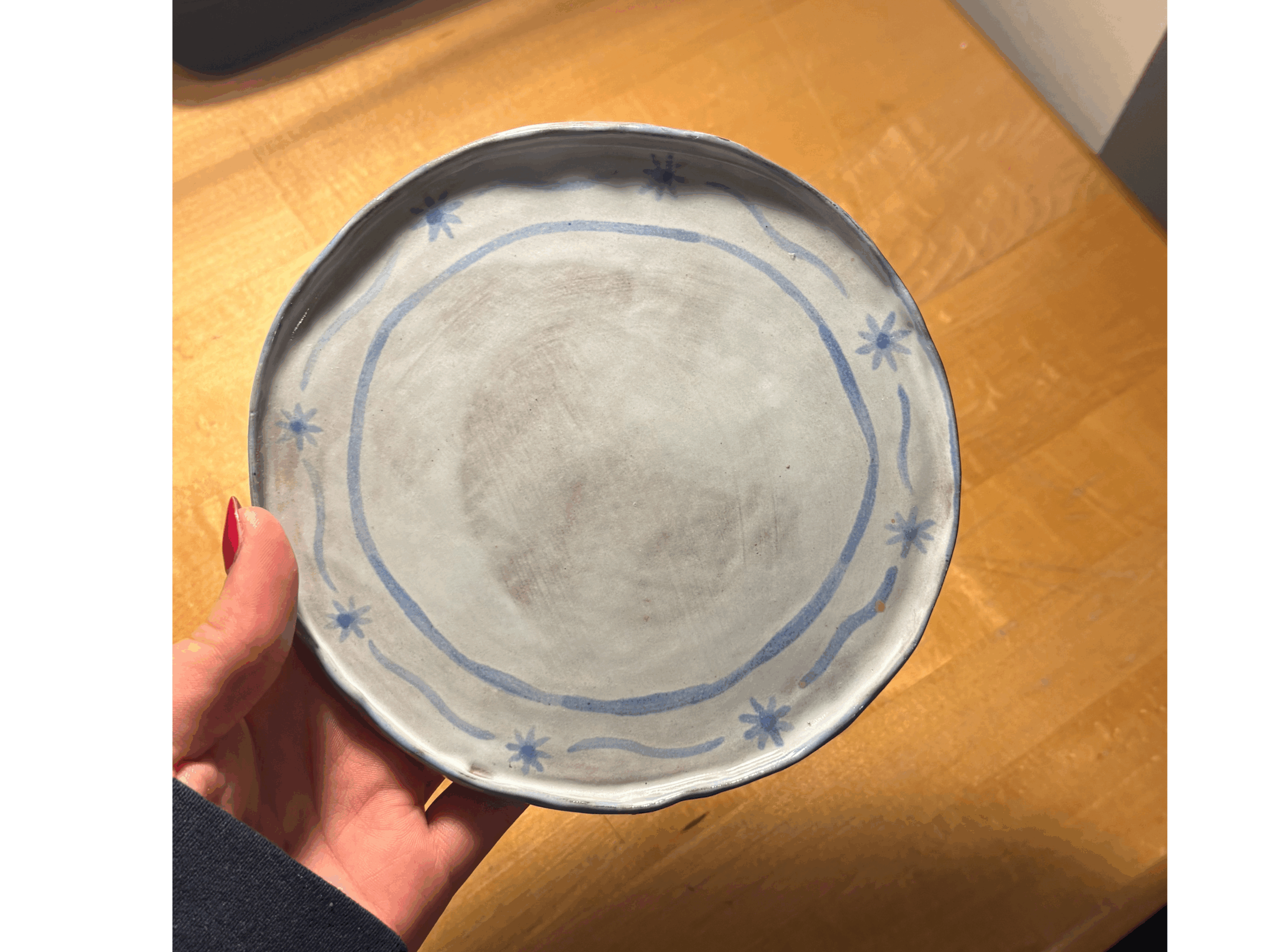
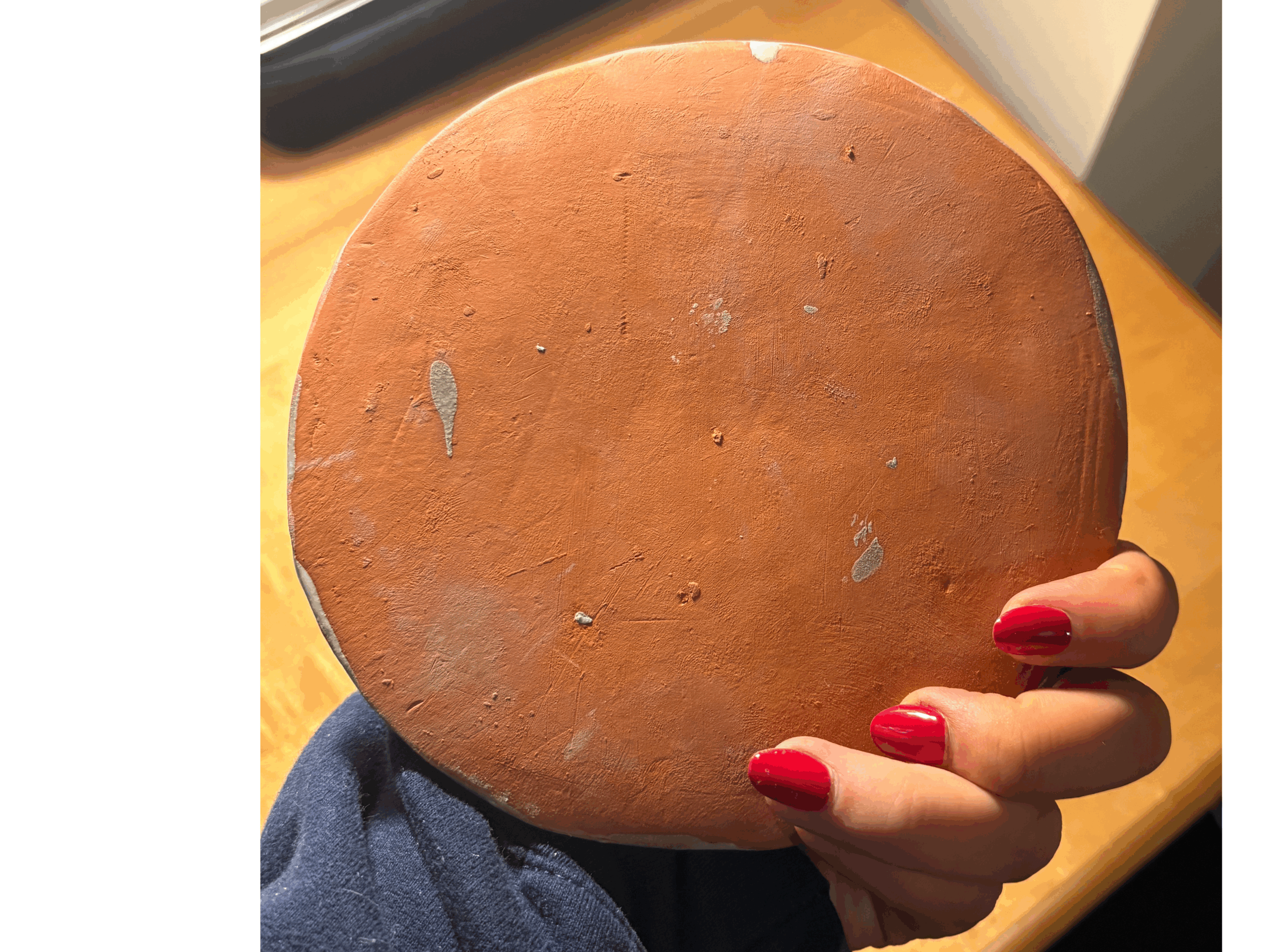
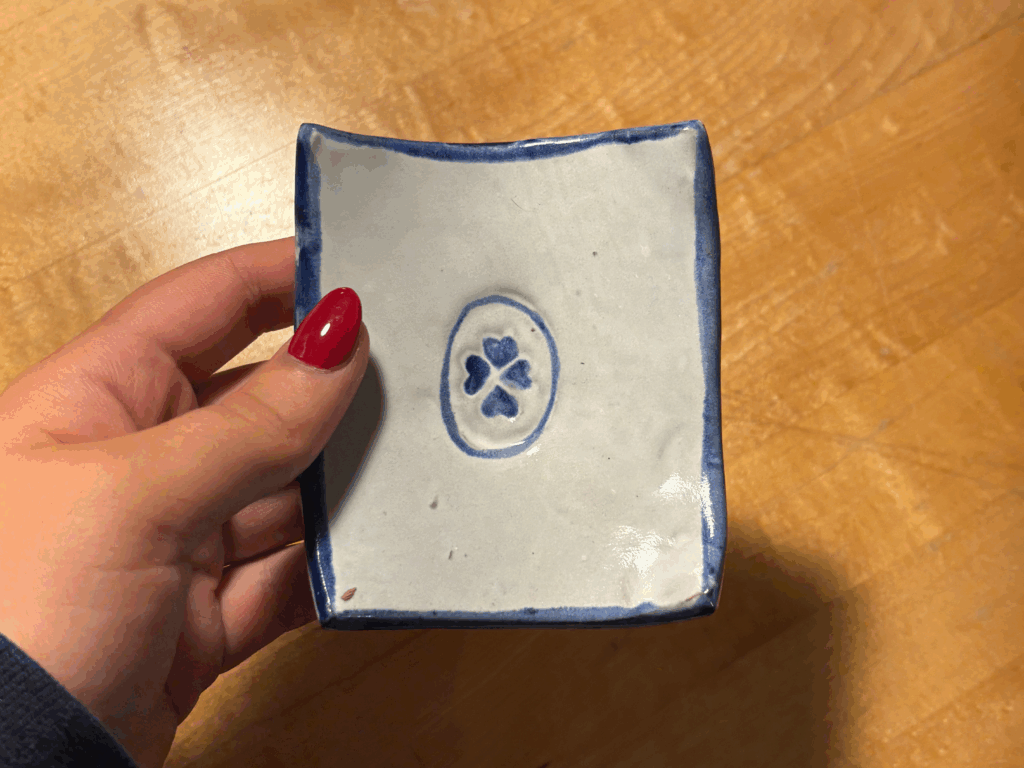
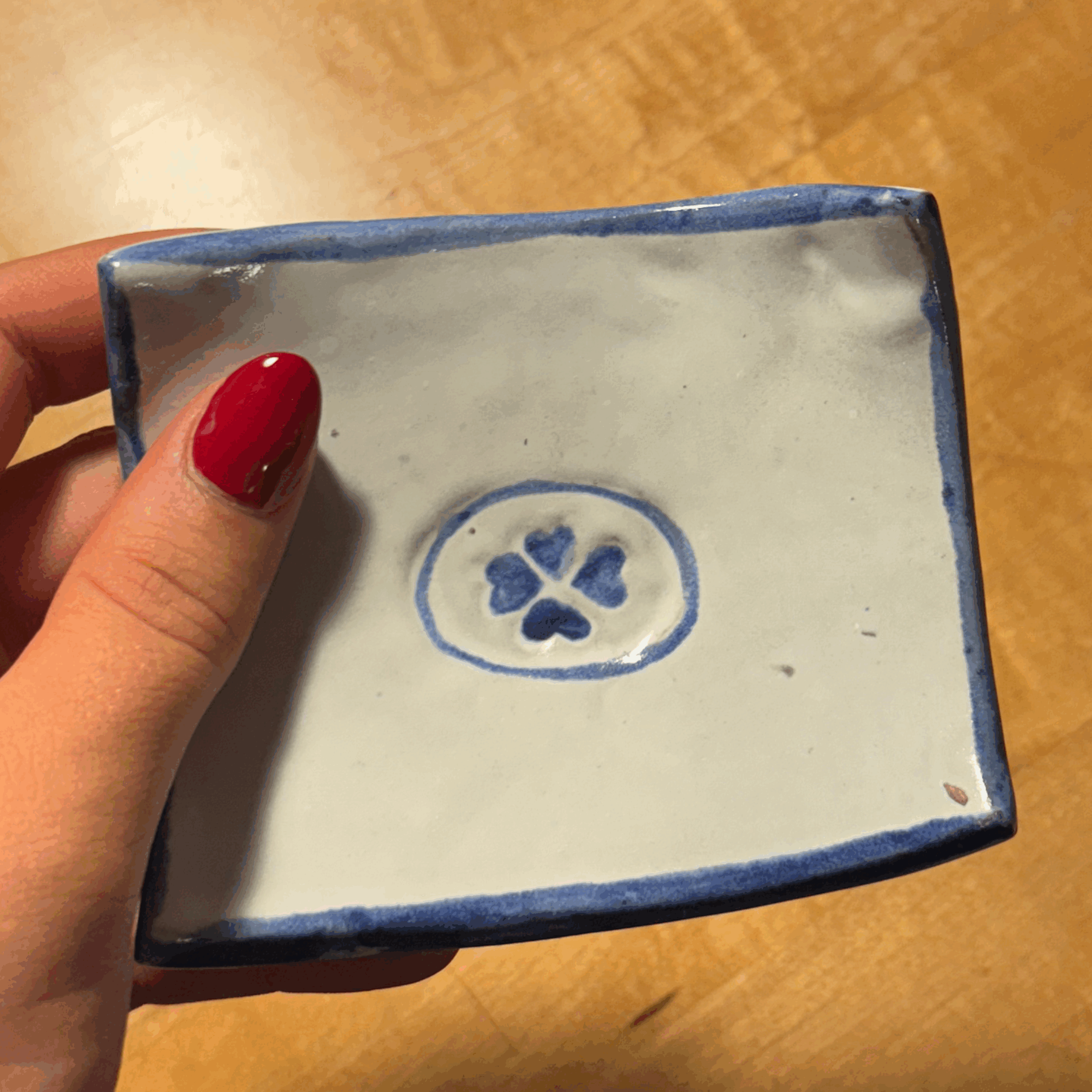
My final attempt was more of a practice piece on the press plate. I used a small four-leaf clover stamp and pressed it into a square slab, which naturally curved into a plate form as the edges lifted. I kept the same blue-and-white palette, but this time I painted over the clover to make the design stand out more clearly. It ended up looking more intentional and refined than I expected, and I’m really happy with how it came out.